Wednesday, December 18, 2013

Mixed Media- Amusement

     For this project, we were introduced to a new medium that I had never truly worked with before. We were tasked with creating a multi-media piece of artwork that parallels to the theme of  "Amusement." Everybody makes collages as a kid, the kind with magazine pieces and glue, so this was kind of like one big arts and crafts project! I really had a lot of fun with this assignment because it was cool to see how I could push myself to make everything looked unified, but also show variety.  I was able to accomplish this by using different colors that compliment each other all within one color scheme, as well as using different shapes of different sizes that all fit together. Also, I used the different material choices in more than one place, and as I kept doing it, it looked more and more like one unified piece. It was definitely a challenge to try and determine what looked good placed next to what, and what would make certain things be more emphasized, but I think overall I was able to accomplish unification as well as variety at the same time.
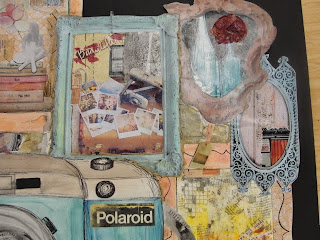
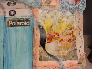
    I am really intrigued by what people have found amusing throughout the ages, so when I was brainstorming ideas, my mind went on the track of the vintage era. I came up with the idea of vintage toys and vintage photography, but as I was sketching, I felt much more inspired by vintage photography. I began with the basic outline of one camera with picture frames surrounding it and began finding images online, in magazines, and images that I created with different found materials. Other materials that I used that created the vintage feeling of when photography was first being used and the amusement that people found through it were old newspaper, tissue paper, and I also experimented with the technique of pen on watercolor. Overall, I am really happy with how this turned out. It is nothing like what I pictured it might turn out when I was first getting started, but that's the beauty of mixed media-there are no mistakes! I think that this image really portrays what I was intending to accomplish with my theme but it a new and unique way!
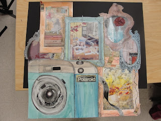
Completed Mixed Media Project

Up Close- Top Right 

Up Close- Bottom Right 

Monday, November 18, 2013

Unconventional Self Portrait

For this project we were faced with the task of creating a portrait, but not any  portrait... A portrait made out of unconventional materials. It was fun to get out of the "norm" of painting and creating with conventional items, and do something unique! I decided to do a picture of myself because who wouldn't want to make themselves out of other things?? I came up with a lot of ideas for what I could make myself out of such as different kinds of chocolate chips, crayon wrappers, and more. I began to think of what we as people are physically made up of, and that is everything that our journey has given us so far. We are made up of our memories and the people that are along for the ride with us on those memories. So, I decided to make my portrait out of none other than black and white photographs that I had! It was really fun because I got to go through lots of old photos of me as a child, my family, and my relatives from a long, long time ago!! 
I copied all of the photos and made them black and white. After they were copied, I cut them up into lots of pieces that I thought would create really good value. It was kind of messy ;) 
I have to admit that looking at all of these tiny "scraps" before i began was kind of intimidating. But that just wanted to make me go for it more!! Before I got started, I went outside when the sun was starting to go down and took a photo of myself. I then loaded it onto the computer and messed with it to get the values that I wanted. 
I began the final piece by painting my canvas and then sketching the silhouette of the body onto it. I filled in all the values by using different sized, shaped, and colored photographs- the lightest pictures portraying the lightest values and the darkest photos portraying the darkest values. It was difficult to get the right placement of everything and figuring out the right values, but I achieved exactly what I had envisioned!! It was really a unique experience to be able to apply everything I have learned thus far about value and composition and apply it to something totally different than anything I have ever done before. I really like the message that I was able to portray with this collage. I think it is so cool how art can tell such an amazing story deeper than how it looks! 

Wednesday, October 23, 2013

"Sticky Situation"

 
     For this project, the theme was "Sticky Situation." While brainstorming ideas for the new assignment, I came up with lots of ideas that I could just simply paint on the canvas such as different candies and suckers. While sketching out different compositions, I couldn't get the idea out of my head of using actual tape to create my sticky situation. So I went with the idea and I couldn't be happier with how it turned out! Creating this piece was actually a very sticky situation because I started out by sculpting the shape of the main rose with layers and layers of masking tape. Let's just say, I got a little wrapped up! After the main rose was completed, I painted the different layers of it being as true to the values as I could be and finished it off by painting the roses in the background. To make repetition a strong element of my piece, I not only repeated the shape and colors of the flowers, but I also tied them all together by incorporating some of the tape into the other flowers. 
     I have worked with acrylics before and I have always been fascinated with how they blend so easily, so I was really excited to have the opportunity to experiment with that with this project. I think there is definitely room to improve my skills with acrylic paint but I think this project really helped to do that. I think that I could have made the highlights a little stronger to show the strength of the light source. I also think that I could have  made some improvements to the shape of the leaf petals, but overall, I believe that this "sticky situation" was a great exhibit of how I have grown as an artist and where I plan to go!  
    

Tuesday, October 1, 2013

Up Close and Personal


For this piece, the theme was "Up close and personal." I played around a lot with what I thought truly fit this theme. I actually was pretty far along in the design phase working on the idea of "Objects in mirror are closer than they appear," really just doing it because I was running out of time and couldn't think of anything better ;) However, as I was planning out that project, the idea of bubbles came into my head. And it stayed there. And I couldn't get it out. So I went with it! And I have to say, I am really pleased with how this turned out. It was definitely a risk but I think that it paid off. I think that I really grew as an artist through this piece, not only in the skills that I learned, but in being inspired and really going with my gut. I truly believe that to create a good piece, you have to put all of your soul into it; that will show through in the final outcome, no matter how the technique is showed.

With this piece, we were told to focus on emphasis. I showed emphasis by playing up the size of the bubble and making that the focus in proportion to the rest of the piece. I used oil pastels to create this piece because I have worked with them before but never on such a large scale. Also, I was really interested in improving my technique with them and learning how to use them better. While I definitely think that I can continue to improve my technique with pastels, I am really happy with how this turned out! This piece symbolizes a lot of growth for me as an artist in my skills, concepts, and most importantly, in emotion. I am excited to take this growth and apply it to future works!

Saturday, September 14, 2013

What's the Point?

     Welcome back! So the new semester has started and I am so excited for what Art II has to offer. This year for the new semester, after given a topic, we have the opportunity for each new project to interpret it according to however we feel inspired by it. We started off with our first project right away with the theme of "What's the Point," and I have to say, I am really happy with how the final piece turned out. I started off by coming up with a list of things that came to mind when I thought of this theme. Some things that I came up with included points on a star, Ballerina Pointe, and more. What I felt truly inspired by, though, was the interpretation of an interesting "Point of View."
     I felt really inspired by taking the idea of a unique perspective literally as well as figuratively. I played around with the idea of using contrasting colors to display the idea of a true artistic perspective as well as the idea of people's different perspectives on ways of living. The light, airy feeling evoked from the farm side was created by using white paper and charcoal. It displays a simple feeling and a lighter perspective. The more dark and empty feeling emitted from the city perspective was created with black paper and a white colored pencil. I chose these mediums because I thought that they would do the best job of emitting the contrasting perspectives, but in a cool and unique way! I had never done something like this before, using different media to get across the message of the piece, but I am glad I took the risk and did something that I am proud of as an artist! I am so excited to see what is in store for this year and how much I can grow as an artist!


Tuesday, June 4, 2013

Acrylic Landscape


For our final project this semester, we were asked to pick a picture of a landscape and paint (for the first time!) with acrylics on a canvas. I was super inspired by this photo because I loved how it translated the feeling that actually being there evoked. I think that I was very successful in my overall painting because of this and also because I was able to use all of the techniques that I have learned throughout the course. I was able to see how the various techniques we learned (value, color theory, perspective, etc.) can really work together to create a final piece.

I have really enjoyed the opportunity to have had this course and I truly value how much I have grown as an artist because of this. I can't wait for Art II next year!! Check back for more then :) Enjoy!

Wednesday, May 29, 2013

Biomes Clay Tile


For this piece, we were able to work with clay for the first time to recreate a biome and an animal that may be found in that biome. I chose the grasslands biome and decided to create a peacock within that biome. I chose to do a peacock because I am really intrigued by the unique colors and intricate designs on them. I think that I was really able to capture that unique quality of this bird in my final piece. I used all that we have learned about color theory to give the bird this quality, as well as what we were taught about techniques used for clay. I think that this was really successful because I was able to use a lot of skills that I have aquired throughout the course to complete it! Plus, the gold is a nice touch...who doesn't like a little glitter?? :)

Wednesday, May 1, 2013

Printing Project


For this project, we were asked to get inspired by an animal in it's habitat and sketch it. Then, given linoleum tiles and ex-acto knifes, we carved out the negative spaces. Once we had created our own "print", we transferred the print with ink on brayers onto the paper. The blue areas shown here were what were rolled on after being left raised. We created a series of five final prints using the one tile.

I really liked this project because not only was it fun, I really learned a lot of neat techniques. It was really neat to be able to see start to finish how one tile can turn into multiple prints. Most of my final prints were very sucessful as a result of clean lines, contrasting textures and values, as well as good color combinations. I think that they also turned out so well because I was really inspired throughout the process. I actually went to Alaska this past year and saw this scene for myself.  Being there and actually feeling what the scene provokes truly show through my work. I hope you can see how inspired I was through the final product!

Tuesday, April 16, 2013

Frog Tongue


??? That's what I was thinking too. But I think that this turned out pretty well. We used another photoshop tutorial to blend a picture of a frog and a tongue to create this. I learned a lot of new tools that are available to be able to blend together two pictures in order to make it look realistic such as brush tools, color changes, value tools, and more. Learning these tools will be very helpful in the future to create new forms of art. I really enjoyed this assignment because it was a new way to look at art!

Monday, April 15, 2013

Angry Pancakes


 For this assignment, we watched a tutorial on how to use photoshop and the tools that it has to offer to create a stack of "angry pancakes." This assignment was really neat because it allowed me to see for myself the different techniques that are used a lot of the time to create pieces like this. All of the different tools on Photoshap can be used to create something one of a kind. Although this didn't allow me to be very creative, I think that the things that I learned from making a picture such as this will help me create unique forms of art, different from what is normally thought of as "art." I won't ever look at pancakes the same way again!

Wednesday, March 20, 2013

Portrait Stencils

Original Photo (My best friend and I!)


Finished Product
I really enjoyed this project. Believe it or not, this started as photograph (which I was very inspired by because I love this girl :))  After much messing around with it in Photoshop, the photo was transformed to be just four colors based on the value of that shape. We then transferred those value shapes onto posterboard, carving them out to create our own stencils. After the stencils were finished, we spray painted the layers of values. Many days later, after waiting out the rain and then the muddy grounds that followed, the product was finished, a re-creation of the original image, just much more colorful!


This project was interesting, from the design process to the completed product. It was really neat to see how what we learned about value in the classroom could transfer to different kinds of art, not just what you can create with a pencil and a sketchbook. I do think that there was some things that I could have done differently, including paying attention to the precisness of the stencil and maybe a different color scheme, but considering this was my first time even picking up a bottle of spray paint, I think that this was pretty sucessful! I value any experience that I can get working with a new medium and learning a new skill that will help my personal art. I hope that you enjoy as much as I enjoyed working on it! 

Wednesday, February 27, 2013

Contour Line Shoe Drawing

Contour Line Shoe Drawing


For this assignment, we had to draw a shoe using contour lines and contour lines only. Contour lines are basically lines that define the shape that you are trying to create. This shoe is drawn using only one continuous line, just shaping them differently to form a sneaker.

We had spent days doing contour drawing after contour drawing, everything from blind contours (of which I will not be posting, your welcome) in which we had to draw an object with one continuous line without looking at the paper, to drawing pretty much any inanimate object in sight.

Through the use of filling up probably five or six pages of my sketchbook creating these contour line drawings, I think I have grown tremendously as an artist. Not that I will be going around drawing shoes all the time, but learning how to use the contour lines has helped me to get out of thinking that I have to draw what I think I see, as opposed to what I really see. I believe that this will help me as I continue to grow as an artist and with all mediums as well.

Tuesday, February 12, 2013

Value Forms with the iPad

Forms using values made on the iPad
In class, we have been studying value and how it impacts the two-dimensional drawing. We had previously been doing this with pencil or with oil pastels, but with this assignment, we had the opportunity to use the iPad. The iPad has an App called Layers Pro that allows you to virtually "paint" on it. In a way, using this App was very similar to using oil pastels because the techniques used were similar. The App allows you to use layers to go back and fix mistakes and in addition, a blending tool could be used to blend the colors together. This was also similar to using oil pastels. My "painting" did not turn out exactly how I had planned, but I think that overall, it was a good experience. It allowed me to elaborate on the skills that I had previously acquired.

Using technology to create something like this was new to me. The use of technology can allow you to create many things that paper and pencil does not allow. However, I don't think that using technology allows the artist to be as creative. Nonetheless, this is a different medium to explore that can really help to improve art skills. Overall, I really enjoyed the experience that I gained from this!

Thursday, January 31, 2013

Cartoon Skeleton Drawing

Final drawing compared to the original
cartoon.
Final drawing
For this assignment, we were asked to choose a cartoon character and from there, sketch what we thought that particular character's skeleton would look like. The character that I chose was Ferb from the Disney cartoon, Phineas and Ferb. I chose this character because I was intrigued by the odd proportions of his body and the exagerated shapes. In my drawing, I displayed the full set of primary bones that a human body would inhabit, but the proportions were exagerated; for example, the head is almost as big as the rest of the body. I really tried to focus on the fun and the interest that this created and play that fun into the outcome. I think that this was a really unique intro project because it allowed me to practice my drawing skills in a creative way. Now I can't wait for the rest of the class!