Sunday, March 2, 2014

Mini- Project: Mutlimedia self portrait


      For the past three days, we have been working on a mini project where we had a variety of projects we could choose to work on.  I chose to create a self portrait because I completed one this time last year and I wanted to see how much progress I have made in the past year. We were told that we could use any material that we wanted to complete the project, and since I couldn't decide (there are always so many choices!)  I decided to experiment with three different materials of which I have learned a lot about in the past year: charcoal, pencil, and acrylic paint. This definitely shows how I have grown since last year, because last year at this time, if we were asked to create a self portrait, what else would I use but basic pencil because it's safe? Since then, I have learned to be creative and think outside of the box, as well as to put more "me" into my projects.
     I am so happy with how this turned out! I can really see how I have grown in my technique. I really enjoyed being able to experiment with different materials and learn new skills with them. I looked online for some tutorials on how to get the detail in the hair which is definitely something that I will be able to take with me. Although this wasn't a huge serious project, I am really grateful to have had the opportunity to mess around and see how much I have grown as an artist in the last year. 
Cupcakes and drawing is always good :) 

Saturday, February 22, 2014

Appropriation Final


So my final project for the Appropriation project is completed! I am very happy with how the final piece turned out and I think that it really displays my view as an artist. Mr. Sands has been teaching us about certain qualities that artists possess, so I have chosen three of these qualities that I believe my piece portrays.


  1. Artists Create Original Art: My idea for the project was "Clip Art." This was a completely original idea that I developed when faced with the theme of Appropriation. I was really inspired by the idea so I started brainstorming how I could get my idea across. I had to think very creatively to develop a game plan for how I was going to do that. I think that one of the reasons why I am so happy with the final piece is that I can see all the creativity and originality it took to complete it. 
  2. Artists Develop Art-Making Skills: When I had the idea for how I was going to incorporate the theme of appropriation, I knew right away that I wanted to use mixed media as my medium. I thought the best way to show the idea of works of art inspiring other works of art (clip art!) could best be displayed through using mixed media so I could use actual pieces of art in the design. I have worked with mixed media before, but not often, so I really wanted to broaden my knowledge of the topic and use other materials. I think that with this project, I was able to gain the experience of incorporating different elements in unique ways, but still in a cohesive way. 
  3. Artists Collaborate: With the middle letter, R,  I didn't know if I wanted to use the same material that I had been using for the other two letters, or if I wanted to use acrylic paint. I asked a couple of the other students in my class for their opinion, and the most valuable advice that I got was to do what  I was most inspired by. I think that that is key in all pieces of work, and the advice at that given time was what I needed to hear. I had been too focused on what I thought looked good and not on what I as the artist felt moved by. In the end, I chose the paint because I thought it would show good contrast, and also, I just really wanted to paint! I am really pleased with how it turned out and am glad that stuck to what I was inspired by. 

Friday, February 7, 2014

Snapshot post- Appropriation

    For the new semester, for each assignment, it is our new goal to provide "snapshot posts" so that we can track our progress, reflect on how we have grown, and see where we need to go from here. For this project, our theme was Appropriation, which is the use of borrowed elements in a new piece. We were allowed to use any material that we thought would best get across what we wanted to express with this theme. The idea that I came up with and was most inspired by was "ClipArt."
   
    So far, I have crafted the idea of spelling out "art" using clips of famous artwork. Eventually, all three letters will be hung up with clips on twine so that it has a literal and figurative meaning of "clipart." 
I think that this project is really coming along. I love the idea that I have and am super inspired by it so I can't wait to see where it will go from here. Mr. Sands really wants us to understand how artists grow with each piece of work they compose so he asked that we reflect on how we have grown throughout the project. Here are three Artist Behaviors that I believe I have taken a part of during this project to make the final piece more successful. 
  1. Artists Take Risks: For the material that I am using for this assignment, I chose to use canvas paper that Mr. Sands found in the depth of all his random art supplies. This is something that I have never worked with, so this whole project has been a huge experiment. I didn't know how the canvas would react or even if it would work, so it was a huge risk. I truly believe that in order to grow as an artist, it is very important to step out of your comfort zone, whether that mean trying a new technique or using a new material. I am loving the freedom of just experimenting with it and seeing where the material takes me!
  2. Artists Solve Problems: As I just stated, the materials that I chose for this project were totally new for me, so I didn't know exactly how things would work out. Needless to say, things didn't go perfectly as planned, but I took those flaws and ran with them! For example, when I printed out the "clips" of artwork on the canvas paper, the colors were not as vibrant as I had previously expected. I am definitely taking advantage of this setback, however, as I think that the paler colors make a really great background that will place a lot of emphasis on the letters when they are finished. 
  3. Artists Understand the Art Community: I don't normally use technology in my artwork a lot, as I am pretty technologically challenged. I think in this project though, the use of technology has really benefited the piece. Through this project, I have learned a lot about how technology can enhance a piece, as I was able to print the images directly on the canvas paper. 
Stay Tuned for the final piece!

Monday, January 27, 2014

Text as an Element

    For this mini-assignment, we were given the theme of "Text as an Element" and tasked with creating a piece using words as the main focus and putting that in to action however we saw fit. I decided to work with oil pastels to tackle this theme and I think that my vision really came across. I also decided to create the word "away" with balloons because I thought that it was a clever way to use text, but in a fun way. To put things into perspective for you, if you were to look at this scene from any other position, you would not see the word appear. It only works if you look straight on as it is drawn in the project. I love working with unique perspectives, but creating something like this was a new experience. I love how it turned out, though!     I was able to use a lot of the skills that I have acquired throughout my art career in this project that I believe definitely benefited the overall product. For example, I have learned a lot about the use of color and how that transfers in to the mood of the painting as well as how it can be used to create value. I liked this assignment and hope to be able to do a lot more using text as an element in the future!

Tension

    First post of Art 3! I can't believe that one year ago I had just begun Art in high school. It has been a wonderful ride and I am so grateful for every experience. For this mini-assignment, we were given the theme of "tension," first day of class, no boundaries, just go. We began by brainstorming lists of things that came to mind when we thought of tension. One thing that my group came up with was the idea of not belonging and how that can create tension. So I decided to play around with that as a figurative thing and thought a lot about contrast. That's how I came up with this!
    I began by doing a watercolor design on the whole page. Then, I covered the paper with black acrylic paint, but left the shape of a couple flowers. When the black dried, I then proceeded to create white flowers to balance the contrast between the black and the color. While this shows literal contrast, it also reads the theme of "tension" because the color flowers stand out among the rest.
    While this was just a little exercise, I really like how it came out. I don't usually do abstract work like this, but it was a neat experience to be able to not use value or realism to still get my theme across. I was able to practice certain skills such as composition and line fluidity. For example, I used different sized lines to show emphasis on certain flowers, rather than value in the petals. It was interesting to work on these skills and see how that will be able to transfer in future projects!

Friday, January 10, 2014

Altered Book


    Final project of art 2! It's kind of bittersweet but I am excited to see what the future holds. For this project, we were introduced to a unique new form of art that a lot of artists have been jumping on, altered book carvings. When I first heard the instructions on this, I didn't know how this was was supposed to relate to art, it sounded more like a construction project to me. As I got into it, however, I discovered that there are many forms of art, not just that on paper! It looks really difficult, but having planned out the basic shapes beforehand made it pretty easy! After planning which shapes would be on each level, you just place the mat underneath that level and carve away, slowly getting closer to the back cover. Once everything was carved, which took a LONG time, I painted the cover and the front page to enhance the pieces. 
     The theme that I chose for my book was "Along for the ride." While coming up with ideas and staring pointlessly at the book for some sort of inspiration, I kept envisioning it as a chest. So I just went with it! I believe that the real treasure to be found in a chest is not money or gold, but rather the memories that we hold from others and from trips that we take. I carved various items such as ticket stubs, old letters, photographs, etc. into the book to portray this idea and I think that it read really well! I am really happy with how this turned out especially because of the message "between the lines" ;). I think I really took a risk by incorporating as many components as I did, but I think all of it helps to portray the idea that we really are just along for the ride! I learned a lot from this project such as how to think outside of the box and really push myself to the best of my ability. I also learned about the importance of good composition and that is definitely something I will take with me.  Even though this is not the medium that I usually work with, it was interesting to see how many ways you can approach a project and put your own mark on it. 

Wednesday, December 18, 2013

Mixed Media- Amusement

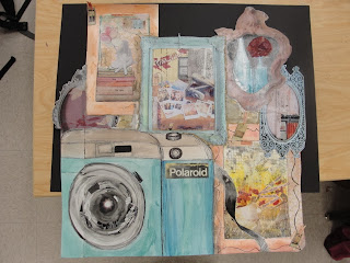
     For this project, we were introduced to a new medium that I had never truly worked with before. We were tasked with creating a multi-media piece of artwork that parallels to the theme of  "Amusement." Everybody makes collages as a kid, the kind with magazine pieces and glue, so this was kind of like one big arts and crafts project! I really had a lot of fun with this assignment because it was cool to see how I could push myself to make everything looked unified, but also show variety.  I was able to accomplish this by using different colors that compliment each other all within one color scheme, as well as using different shapes of different sizes that all fit together. Also, I used the different material choices in more than one place, and as I kept doing it, it looked more and more like one unified piece. It was definitely a challenge to try and determine what looked good placed next to what, and what would make certain things be more emphasized, but I think overall I was able to accomplish unification as well as variety at the same time.
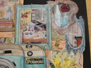
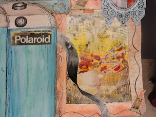
    I am really intrigued by what people have found amusing throughout the ages, so when I was brainstorming ideas, my mind went on the track of the vintage era. I came up with the idea of vintage toys and vintage photography, but as I was sketching, I felt much more inspired by vintage photography. I began with the basic outline of one camera with picture frames surrounding it and began finding images online, in magazines, and images that I created with different found materials. Other materials that I used that created the vintage feeling of when photography was first being used and the amusement that people found through it were old newspaper, tissue paper, and I also experimented with the technique of pen on watercolor. Overall, I am really happy with how this turned out. It is nothing like what I pictured it might turn out when I was first getting started, but that's the beauty of mixed media-there are no mistakes! I think that this image really portrays what I was intending to accomplish with my theme but it a new and unique way!
Completed Mixed Media Project

Up Close- Top Right 

Up Close- Bottom Right